
UPDATED: APRIL 9, 2020 – I L’Oeuf NY, V_2.0
New to me are these regional spins on the iconic I HEART NY logo. I saw them for the first time just recently, alongside even more takes in which the red image between the I and NY represented other aspects of the Empire State.
Though they obviously don’t use the words BUFFALO

or SARATOGA,
![FullSizeRender[1]](https://tweedtypewriter.com/wp-content/uploads/2016/04/fullsizerender11.jpg?w=489&h=139)
to my mind these two renditions can’t help but explicitly represent those cities, and as such, they had me dreaming of an “explicitly” Albany version that would feature the profile of the Capital City’s most iconic building, The Egg.
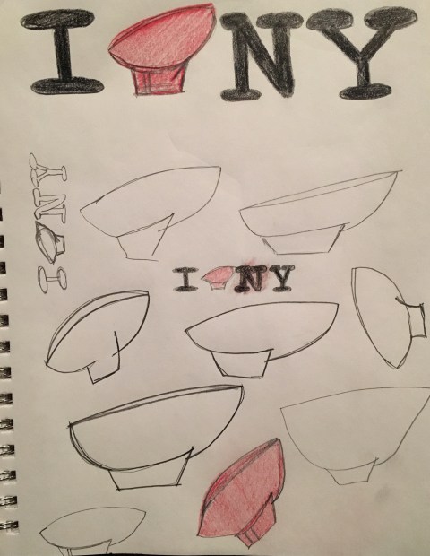
Apologies to the New York State Tourism Bureau if this was already present somewhere on the very billboard where I saw the official buffalo and horse images above. And if it wasn’t: get cracking on production of the “I Egg NY” merch! FOOTNOTE to THE EGG: I can’t put a number on how many times I saw this building in my life before the day I stood before it on assignment to direct a short film about a football player from Albany. That day, for the first time ever to me, The Egg looked like a football: virtually the top of the Lombardi Trophy itself, tipped slightly and blown up a lot.
In all that I-Hearting I came across this fabulous story of the original logo, the remarkable designer who created it, and the interesting life that both man and art have led. Definitely worth a read and/or listen, via the podcast 99% Invisible.
